
Screen Shot Saturday Madness! - Gallery Posted 12/12/2020
^^ I'm glad that my comments were taken as intended: as helpful suggestions. And no, trains aren't required. Generally the train makes the image more interesting and adds action, but abstract track shots can and do work well on their own. It has to be intentional and work on its own as art, and not seem like you weren't patient enough to wait for a train to arrive to grab the screen.
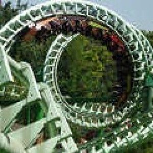
^ Nice work using parts of Drachen Fire track to frame other parts of the ride. First one is going in and that makes 6!
-Ride_Op

Night-Hawk Reborn by Albo85
Hey it's time to vote again! NoLimits 2 Screen Shot Saturday Madness June 1, 2019
-Ride_Op

1 down for the next SSS! 5 more needed to post a gallery.
-Ride_Op

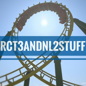


Aerotitan by me


Collider by Joseph Pojunis and JAKool, photo by me
^Almost everything in that shot aside from the track shaping was created by JAKool, so that's probably a credit worth adding, as much as I'd love to be responsible for those supports!
Good point, I added him!
Can I change mine, I think the non edited version of this shot actually looks better.

Third shot of Aerotitan is the most interesting with track going from corner to corner. Really pulls the eyes back and forth nicely. However, the train is not in the best spot...it should be on track in the foreground for the most dramatic impact. Would you please take that one again with the train coming in from the upper right? That'd be an awesome shot then!
Collider is in, and sure Jake.
RedLimitsCoasters, your shot is far away from the coaster. Most of the image is the surrounding foliage, queue line, and station, with the coaster in the middle top sixth of the shot, and given how little of the shot is devoted to the coaster, the viewer is left wondering what is the subject of the shot. Nothing is particularly prominent or featured there. Get closer or look for another angle.
Once Aerotitan gets a new take of that third shot, we have 3.
-Ride_Op
Took it again, but I could not decide which one I liked the most


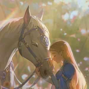

Lightwing by me
How about a little bit of a throwback? Nighthawk by JetstreamCoasters


Two more in. One more for a gallery!
-Ride_Op


The Old West area at Crowne Point featuring Grizzly and Timberliner
Probably been used a few too many times but here is another if your short:

Journey to Agartha by Aether Systems.
This screenshot looks really amazing Element 115!

Nice shot RLC! The track winding back and forth through the shot and exiting into the lower left draws the eye naturally along and creates a lot of visual excitement.
And Journey is an obvious shoe in. Nice angle of it.
4 more needed for the next gallery!
-Ride_Op
The Wild Legend - Lagoon's Pioneer Village - At Night!

Night can make things dramatic, but offers it's own challenges. Lighted areas in a shot like this automatically draw your eye. Looking where the light is brightest, our eyes are drawn to the midway with shops, where a couple of red buildings really stand out, trees, some coaster track, and a red sign at the top of the lift. The train is diving out away from the light, into shadows, and because of this doesn't become the focus. There are huge amounts of dark, inky, Scourge like blackness around the image in the corners, with a huge chunk in the lower right corner. Around half the image is just black, and the areas that aren't black are not really supposed to be the subject of your image.
So, what to think about to improve...a bit more lighting would help in the areas you want to draw the eye to. The train further in the light would help. Less black in the image...move around so you don't get that much empty blackness in there. And unless you want the viewer's eyes to look at your midway buildings, you'll want to frame the shot differently and adjust the lighting so that isn't the first thing people see when looking at this image.
That's a lot of feedback. It's not meant to sound nit-picky, just honest feedback from a photographer to help you think about additional things when composing the image.
-Ride_Op
No idea if this is still a thing, but I am gonna drop these two pictures in here:


Maelstrom by Emonadeo
(It might be worth noting, that this coaster was built on the template of the Seaside Screamer 2 contest hosted by Coasterguy246, so the Arrow Looper and decoration around it are not actually by me, as it was part of the template)
Osprey by Jakool
Drachen Fire by JasonZ617
Mountaineer by CoasterMac305