
Custom NL2 Skins
Train skins? Or what kind of skins do you mean? And I suggest posting this in The NoLimits 2 Mega Resource Thread - Guides, Tools, Scripts forum
Seems skin for the main program.
Goes without saying that you do this at your own risk. We do not advise it.
-Ride_Op

I don't have the skin folder. Shoud I create that manually ?
I find a lil creapy to mess around in the main game directory stucture. We do not advise it.
Come on... its just changing the UI overlay, if you mess up you just have to delete the edited file and its all back to normal.

Hey, I'm having a lot of fun messing around trying to create a slightly flatter dark theme with this, thank you for sharing this option with us.
I'm having a problem right now that I just can't find the solution for where the 3d bevel effect from the default theme doesn't seem to be visible in my edited version anymore, at first I thought I must've replaced the colour codes for the bevel effect with my background colour but then I replaced every single of the new background colour codes I had with a placeholder pink colour to find the trouble causer without any success.
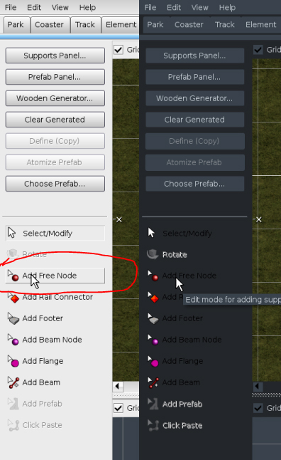
Here's a comparison on what it should look like vs what it looks like for me at the moment:
I can't seem to find the option to change the colour of the titles for that specific tab (list of track and support tools) either, I've only really messed around with the "default.xml" file so far as the "default_windows.xml" doesn't seem to do any changes for me.
If you have any pointer where in the code these specific options would be, that would be fantastic!
Search for element smallborderup:
  <element name="smallborderup">
    <style>
      <set color="border3dhigh"/>
      <drawline x1="0" y1="0" x2="WIDTH-1LS" y2="0"/>
      <drawline x1="0" y1="0" x2="0" y2="HEIGHT-1LS"/>
      <set color="border3dmid"/>
      <drawline x1="0" y1="HEIGHT-1LS" x2="WIDTH-1LS" y2="HEIGHT-1LS"/>
      <drawline x1="WIDTH-1LS" y1="0" x2="WIDTH-1LS" y2="HEIGHT"/>
    </style>
  </element>
You can see the bevel is build here, used colors: border3dhigh and border3dmid which are defined at the very beginning of the file:
  <color id="border3dhigh" value="#00FFFFFF"/>
  <color id="border3dmid" value="#808080FF"/>
Both colors are referenced from other elements, so maybe just add an own color definition.
smallborderup is used here on toolButton::MOUSE_OVER:
  <element name="toolButton">
    <style>
      <property name="defaultSize" value="80 22" type="size"/>
      <property name="defaultForegroundColor" value="#000000FF" type="color"/>
      <property name="font" value="button" type="fontid"/>

      <if state="ENABLED">
        <if state="SELECTED">
          <drawelem name="smallBorder" x1="0" y1="0" x2="WIDTH" y2="HEIGHT"/>
        </if>
        <if state="not SELECTED">
          <if state="MOUSE_OVER">
            <drawelem name="smallborderup" x1="0" y1="0" x2="WIDTH" y2="HEIGHT"/>
          </if>
        </if>
      </if>
    </style>
  </element>
I just noticed, you can´t change the black and disabled text colors. So you need to manually textout with custom text colors in element toolButton this way:
  <element name="toolButton">
    <style>
      <property name="defaultSize" value="80 22" type="size"/>

      <set fontid="button"/>
      <set colorproperty="foregroundColor"/>

      <if state="ENABLED">
        <set color="#0000FFFF"/> <!-- custom text color for disabled -->
        <printtext x="25LS" y="HEIGHT/2" property="title" halign="left" valign="middle"/>

        <if state="SELECTED">
          <drawelem name="smallBorder" x1="0" y1="0" x2="WIDTH" y2="HEIGHT"/>
        </if>
        <if state="not SELECTED">
          <if state="MOUSE_OVER">
            <drawelem name="smallborderup" x1="0" y1="0" x2="WIDTH" y2="HEIGHT"/>
          </if>
        </if>
      </if>
      <if state="DISABLED">
        <set saturation="30"/> <!-- change the saturation :) -->
        <set color="#00FFFFFF"/> <!-- custom text color for disabled -->
        <printtext x="25LS" y="HEIGHT/2" property="title" halign="left" valign="middle"/>
      </if>
    </style>
  </element>
Thank you so much, that's been a big help!
This seems to no longer work with NL2 v 2.6.5.2?
place these into /NoLimits 2 Directory/data/skin:
Have fun creating new skins for nl2 :)